Key Takeaways
- Black and white fine art suits minimalist, executive, and serene interiors by emphasizing form, texture, and timeless sophistication.
- Color fine art excels in warm, social, and nature-inspired spaces where energy and emotional connection matter most.
- Neither style is universally “better”—the right choice depends on room function, existing palette, and desired mood.
- A black and white horse print like “Khan” symbolizes power-with-restraint; a colorful wildlife print (lions or birds) symbolizes untamed energy and life.
- Current luxury home decor trends favor neutral foundations with either monochrome photography or strategic color accents as focal points.
Introduction: The Mood of Your Home in 2 Seconds
Guests form an impression of your home’s atmosphere within seconds of stepping through the door—and the art on your walls often delivers that first emotional signal. For homeowners renovating or furnishing in 2026, a persistent dilemma emerges: should you invest in the timeless elegance of black and white or the vivid presence of color fine art?
Current black and white interior design trends favor neutral, minimalist bases—white walls, natural stone, warm wood—paired either with monochrome pieces for gallery-like calm or bold color accents that anchor entire rooms. The choice between black and white vs color fine art shapes how every other design element reads.
This article helps you choose based on psychology, interior style, and room function rather than guesswork. The perspective here comes from an art-focused approach to statement pieces for modern, upscale interiors.
The Psychology of Black and White vs. Color in Fine Art
Color—or its absence—is one of the strongest emotional levers in any artwork. Viewers often feel the mood of a piece before they consciously recognize the subject.
The effect of black and white: Removing color shifts attention to contrast, light, shadow, and composition. Black and white photography simplifies reality, highlighting structure, emotion, and depth while allowing viewers to focus on details that might otherwise get lost. Monochrome emphasizes composition, form, texture, and light by stripping away color entirely. This creates associations with photography’s early history (late 1800s through mid-1900s), adding a timeless, archival quality that feels refined rather than dated. In portrait photography, black and white can convey timelessness and introspection, while color portraits can convey vibrancy and personality, depending on the desired mood.
The effect of color: Colors act as powerful emotional triggers. Warm tones like yellow add warmth and evoke happiness, blue brings calm or signals cold and loneliness, and red demands attention—directly influencing how viewers interpret art. Color captures the world as we see it and can convey specific emotions and atmosphere, such as coziness, warmth, or creative energy, through intentional color choices. This makes color photography particularly effective for “bringing the outside in,” whether through forests, oceans, or savannas.
Before choosing subject matter, think first about the feeling you want: serene and focused, or vibrant and sociable.
Black and White Fine Art: Minimalist, Executive, and Serene Spaces
Black and white interior design has become a staple in luxury homes and high-end offices from 2020–2026 because it looks intentional rather than trend-chasing. Black and white photography creates visual calm and is ideal for minimalist or monochrome interiors, emphasizing forms, lines, light, and shadow.
How it interacts with luxury palettes:
- Grayscale art pairs seamlessly with marble, concrete, smoked glass, oak, and walnut finishes
- A black and white print avoids clashing with existing accent colors in pillows, rugs, or furniture
- Black and white images offer a timeless quality, remaining relevant for decades by transcending modern trends
Where black and white art works best:
| Room Type | Why It Works |
|---|---|
| Executive offices and boardrooms | Restraint and clarity prized in law and finance |
| Minimalist living rooms | Low visual noise with white walls and simple furniture |
| Bedrooms and reading corners | Calm, contemplative atmosphere |
Black and white art can create a more solitary environment that encourages reflection, amplifying a sense of calm or introspection through its focus on tonal gradation and shadow. Monochrome creates a sense of history or a “timeless” quality that transcends specific eras.
Black and white photography is particularly effective in calm, stylishly designed rooms, such as minimalist or monochrome interiors. Consider a 36×48-inch black and white print above a low-profile sofa to establish gallery-like calm, or a triptych in a glass-walled office to underscore professional restraint. These black and white pieces amplify negative space and refined shadows—core principles of minimalist wall art.

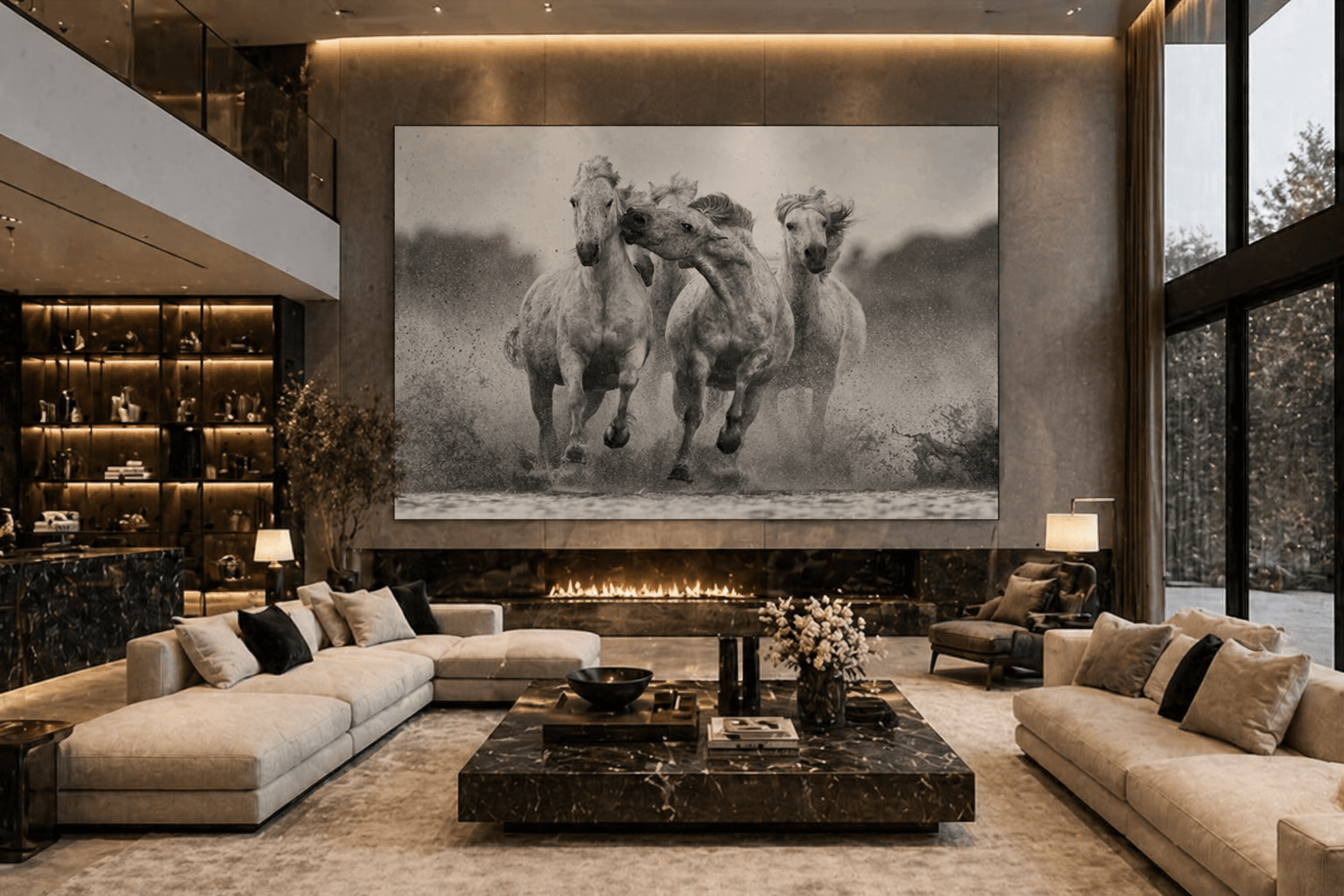
The “Khan” Horse vs. Colorful Wildlife: Power, Restraint, and Raw Energy
Consider “Khan” as a representative black and white horse print—a case study in how the presence or absence of color transforms mood entirely.
The black and white “Khan” horse print: The image captures the animal mid-stride, muscles and mane rendered in fine grayscale detail. High contrast draws the viewer’s eye across texture and form rather than surface distractions. Monochrome is frequently used to capture raw emotion or the soul of a subject, and Khan embodies exactly this. The symbolism speaks to controlled power, discipline, and inner strength—authority without shouting. This visual language suits executive offices, home libraries, or modern lofts where homeowners want sophistication with quiet confidence.
Colorful wildlife in contrast: Picture a pride of lions at golden hour, or vivid birds against a green canopy. Rich golds, greens, and blues carry warmth, vitality, and a “safari at sunset” atmosphere. These color images project raw, outward energy through hue rather than restraint through shadow.
The difference is clear: choosing Khan in black and white says “power under control.” Choosing a colorful wildlife print says “life, adventure, and movement.” The same theme—majestic animals—communicates entirely different tones depending on whether color makes its presence felt.

Color Fine Art: Energy, Warmth, and Bringing the Outside In
Color art is the fastest way to transform a room from quiet gallery to lived-in, energized space. Color photography is particularly effective in communal spaces like living rooms and dining areas, where it enhances warmth and liveliness.
How color shapes specific rooms:
- Living rooms and great rooms: Bold landscapes or wildlife in greens, blues, and golds echo outdoor views—whether California hills, Mediterranean coasts, or African savannas
- Dining areas and kitchens: Warm, saturated hues make spaces feel welcoming and social, ideal for gatherings
- Creative studios and kids’ rooms: Playful palettes and abstract color photos stimulate imagination
Color photography is best suited for spaces that require warmth and energy, such as living and dining areas, children’s rooms, and open-plan kitchens, where it can enhance the atmosphere.
Color highlights specific cultural or environmental details, such as the vibrancy of a street market or the hues of a sunset. A large color photograph of a Kenyan savanna at sunset extends views in urban apartments where windows don’t open onto nature. Colors directly influence our perception and can create moods, reflect seasons, and establish contrasts or harmony throughout a display.
Color photography is particularly suitable for spaces that have a personal, warm, or creative atmosphere. However, balance matters. Vivid or clashing colors can distract the viewer from the intended subject. In already colorful rooms with patterned rugs or bright sofas, art should harmonize with one or two dominant hues or stay slightly desaturated. In a neutral, stone-and-linen living room, a single vivid color piece becomes the anchor of the entire design. It’s important to choose color carefully, testing different options in various lighting conditions to see which enhances the room’s visual impact.

Matching Art Style to Room Function and Aesthetic
The best way to decide between black and white and color is to start with the room’s purpose and existing aesthetic.
For serene and focused rooms:
- Bedrooms, home offices, reading nooks, and meditation corners benefit from black and white or very muted tones
- Subjects like horses, quiet landscapes, and architectural forms in grayscale create luxury, hotel-like calm
- In corporate settings, black and white images can bring a refined tone to meeting rooms and hallways
For social and high-traffic rooms:
- Living rooms, dining rooms, hallways, and entryways often benefit from color, especially if you entertain often
- Wildlife, landscapes, or abstract color fields invite conversation and emotional engagement
- Color visuals are more effective in collaborative areas and reception spaces to create a lively environment
A simple decision framework:
| Room Purpose | Recommended Style |
|---|---|
| Focus, rest, reflection | Lean black and white |
| Gathering, celebration, creativity | Lean color |
| Double-duty (open-plan) | Mix both in controlled palette |
In 2024–2026, many upscale homes use black metal frames, monochrome photography, and neutral textiles as a base, then layer one or two strategic color pieces. Minimalist lovers can start with black and white fine art and add color slowly to test comfort level.
Combining Black and White and Color in One Home
Homeowners don’t have to pick a side. Some of the most compelling luxury interiors use a deliberate mix of monochrome and color art throughout different tones and spaces.
A room-by-room strategy:
- Black and white in formal or quiet zones: office, bedroom, formal sitting room
- Color in communal or transitional areas: kitchen, living room, stairwells, long corridors
Tips for a cohesive look:
- Repeat one element—a recurring subject (horses, birds, landscapes) or frame style—to tie pieces together
- Keep frames consistent (black metal or thin oak) so a mixed collection feels curated, not random
- Limit your overall palette to prevent visual chaos
Gallery wall example: Center a large color wildlife piece—lions at dusk—surrounded by smaller black and white detail shots showing mane close-ups, hoofprints, or landscape textures. This layout balances quiet power and vivid energy on the same wall while maintaining a unified theme.
Before drilling into walls, lay pieces on the floor or use digital mockups to experiment with arrangements.
Practical Tips: Size, Placement, and Light for Black and White vs. Color
The same art piece can feel entirely different depending on scale, placement, and lighting.
Sizing considerations:
| Art Type | Recommended Size | Best Placement |
|---|---|---|
| Black and white | Large (40×60 inches) | Above sofas, beds, console tables |
| Color | Medium to large | Eye level in dining/living areas |
Large black and white pieces create expansive calm, while color pieces at eye level ensure hues remain clearly visible and engaging where people gather.
Placement relative to architecture:
- Center major works on key architectural lines—over fireplaces, between windows—for a clean look
- Black and white pieces can visually stretch smaller rooms by reducing competing elements
- Bold color can anchor large, open walls that need a focal point
Lighting matters:
- Directional spotlights or picture lights deepen shadows and highlight texture in black and white prints
- Warmer bulbs (2700–3000K) enrich golds, greens, and skin tones in color landscape and wildlife photographs
- Slightly cooler light (3000–3500K) sharpens monochrome contrast without washing out depth
- Without careful attention to contrast and tonal range, a black and white image can appear muddy or dominated by uninteresting gray tones
- Monochrome is more forgiving with technical imperfections, making grain or digital noise appear more intentional
- Managing color harmony and ensuring accurate tone reproduction across different printers requires significant technical skill
Testing advice: Lean a print against the wall for a few days in both daytime and evening light before final placement. High-quality reproductions retain tonal depth in black and white and accurate hues in color under varied lighting—this is where investing in fine art prints pays off.

FAQ
Should I keep my entire home either black and white or fully colorful?
It’s not necessary to commit to only one style. Many high-end homes mix both, using black and white art in quiet, private rooms and color in social spaces. Consistency comes from repeating subjects, frame styles, or a limited palette rather than forcing every piece to match. Start by defining a few “mood zones” in your home—calm, focused, social—and assign black and white or color accordingly.
Does black and white art make a small room feel bigger than color?
Black and white can make small rooms feel more open because fewer competing visual elements allow the eye to read the space as calmer. Overly busy or high-saturation color can visually shrink a compact space. However, a single, well-chosen color piece with ample negative space can still work beautifully. For very compact bedrooms or office settings, one large black and white statement piece often works better than many small, colorful artworks.
How do I choose between a black and white horse print and a colorful wildlife print if I like both?
Use the room’s function as your tiebreaker. Choose the black and white horse like Khan for spaces where you want control, focus, and sophistication. Choose colorful wildlife for spaces where you want movement, energy, and conversation. Consider what you want to feel walking into that room at 7 a.m. or after work—steady and composed, or uplifted and inspired. Many homeowners display Khan in an office or bedroom and reserve colorful wildlife for living and dining areas in the same way, enjoying both moods in daily life.
Will black and white fine art go out of style faster than color, or vice versa?
Both can be timeless if subject, composition, and print quality are strong. Trends usually affect framing styles and themes more than the presence or absence of color. Black and white has remained relevant since early 20th-century photography, while classic color landscapes and wildlife have also endured through decades of design shifts. Color palettes can date an image, making it feel specific to a particular decade, so choose pieces based on long-term emotional resonance rather than short-lived bright trends. Monochrome can feel less relatable because humans naturally see in color, but its timeless draw persists. Removing color from images that focus heavily on it can leave the picture feeling empty—so match the subject to the treatment.
How do luxury home decor trends from 2024–2026 influence my choice today?
Recent trends favor neutral foundations—stone, wood, soft whites—with either monochrome photography or carefully chosen color accents. Investing in black and white pieces of iconic subjects like horses or architecture is a safe long-term choice, while a smaller number of bold color works can be swapped as tastes evolve. View trends as guidance, not rules: prioritize a cohesive story of power, serenity, or vitality throughout your home over chasing every new shades or gloss of the year. The human brain responds to what feels right in a space, and that feeling should stand for years to come.